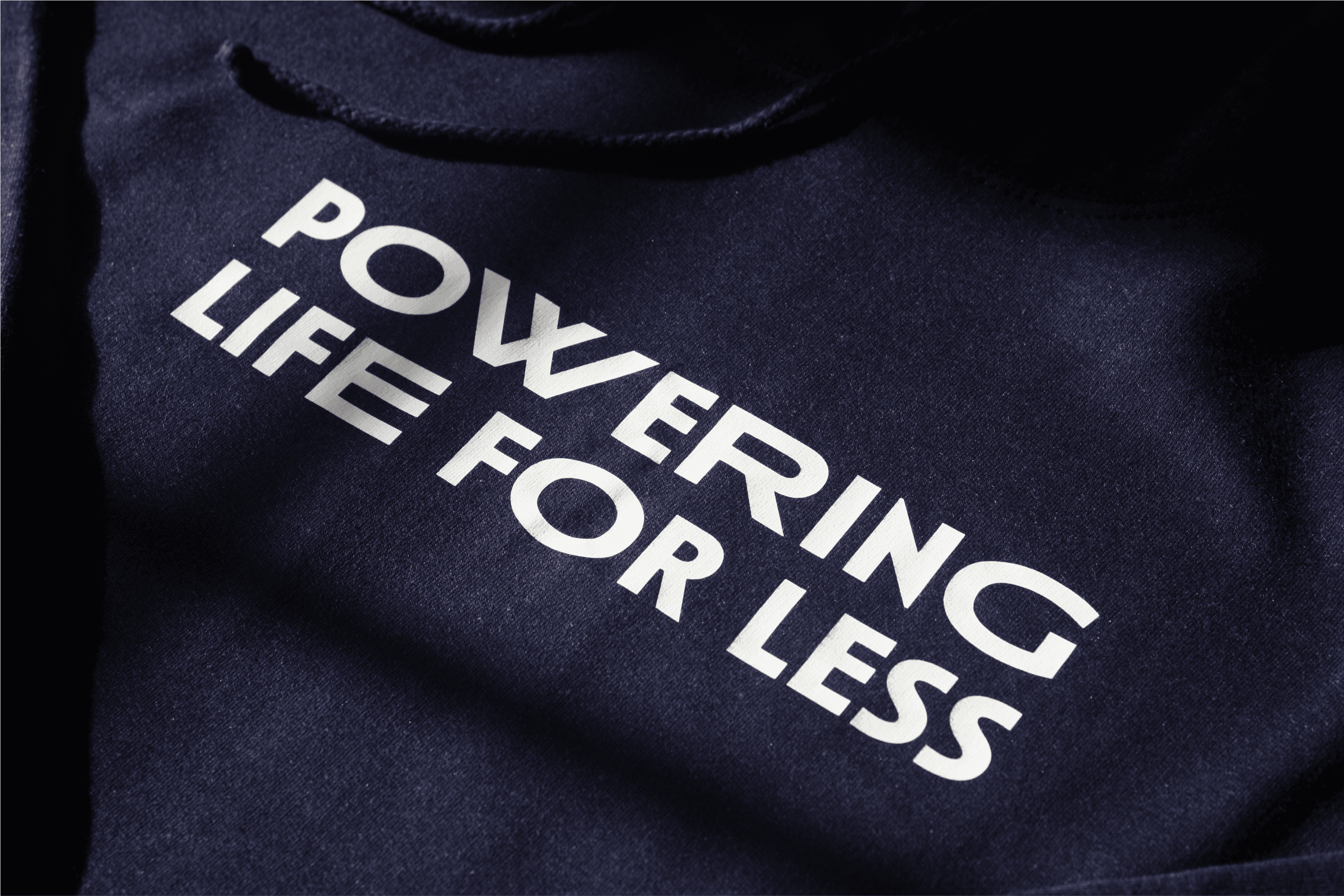
As part of Guernsey Electricity’s ‘Powering Life for Less’ campaign we created a visual identity to use across all aspects of design. Tying together YouTube pre roll, social content, printed merchandise and the website landing page. The identity acted as an extension of the GE brand focusing purely on delivering insight into ways to help bring down your energy bill.
We wanted the identity to encapsulate the purpose of the campaign. Focusing on the concept of ‘reduction’ we chose a variable font which allowed us to mix wide and thin characters together creating a word mark that both expands and shrinks. We brought this to life using animation to emphasise the ‘LESS’ by shrinking the word down.
The wordmark sits within a downwards arrow - to simply imply ‘cutting down on energy and costs’. Once the identity had been established, we were able to use this device on its own to frame information on the Guernsey Electricity social channels, and on stickers installed in the Powering Life For Less participants' homes during the challenge to help inform them of their low-rate times.
Author
Lydia Trow
Creative
Lydia is a creative with a specialism in design. She graduated from Northumbria University with First Class Honours in Graphic Design and was awarded a D&Ad New Blood Pencil. She focuses on creating distinctive branding that can be applied across print, digital, animation, collateral and beyond